Apartment Finder - App Prototype
Overview
Classes: Role: Teammates: Tools Used: Timeline: Research: September - November 2023.Apartment Finder - Research
User Research
We started this project by asking ourselves: what is a common issue that people face which we can attempt to solve?
One of the issues that came to my mind was affordable housing. I had heard from many people how difficult and frustrating the apartment hunting process was.
Our group decided to tackle this topic as it was something we could all relate to: each of us had to find a place to live while having a busy life as a student.
How can we improve the housing hunting experience?
- Uncover innovative approaches and features
- Make the process more convenient, efficient, and enjoyable.
What are common pain points when searching for an apartment?
- Understanding the pain points in the current apartment experience.
- Help identify areas where our platform can provide solutions or improvements
User Interviews
I conducted interviews from 3 different users to help kickstart our research process. In each of my interviews I asked about their latest apartment hunting experience, their latest touring experience, what they look for in an apartment, their current living situation, and their experience with the landlord.
- Apartment hunting website are not always up to date,
- Landlords are not always communicative,
- It is overwhelming to look at all of the information surrounding apartments
- Issues navigating the maps on apartment websites, due to not knowing the area nor the measurements, so he had no idea how far apart listings were.
The interviews were a great way to get insight into more than just the digital aspect of house hunting. The one flaw was not being able to see the websites and tools people used to conduct these searches. This is however, where the next method used comes in handy.
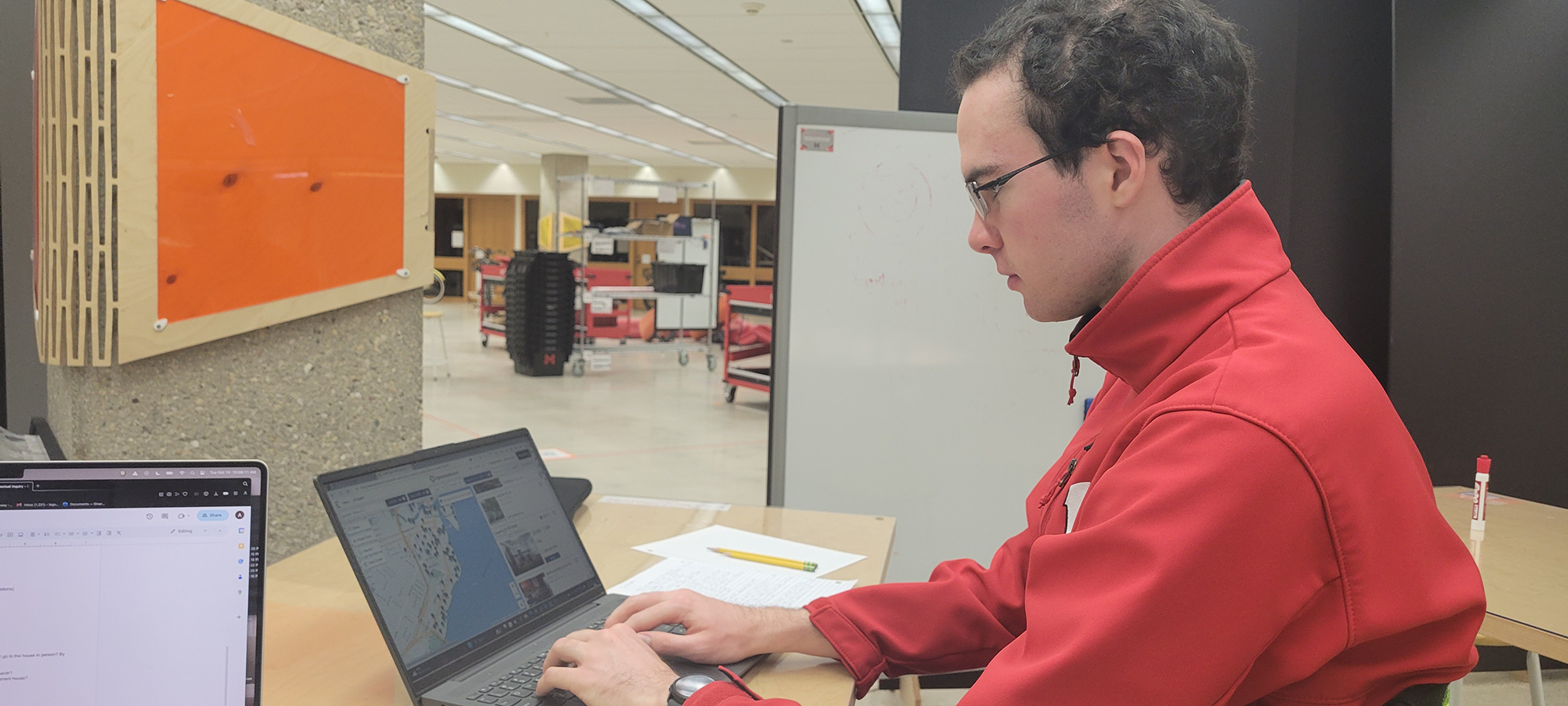
Contextual Inquiry
- Sakshi would track her apartment search in a seperate spreadsheet, a feature that the site she used lacked.
- Sakshi would also search for reviews of the apartment on Google, in order to learn more about the apartment and the landlord.
- She did this because she valued her safety and wanted more information than what the site offered.
- Donald had to double check the location of the apartment using Google maps in addition to the map apartments.com had.
- He found the map to be confusing, as he couldn’t tell which pin was pointing to the current listing.
- Donald also valued when websites had accurate information, as sometimes listings would appear on the website that were currently not renting.
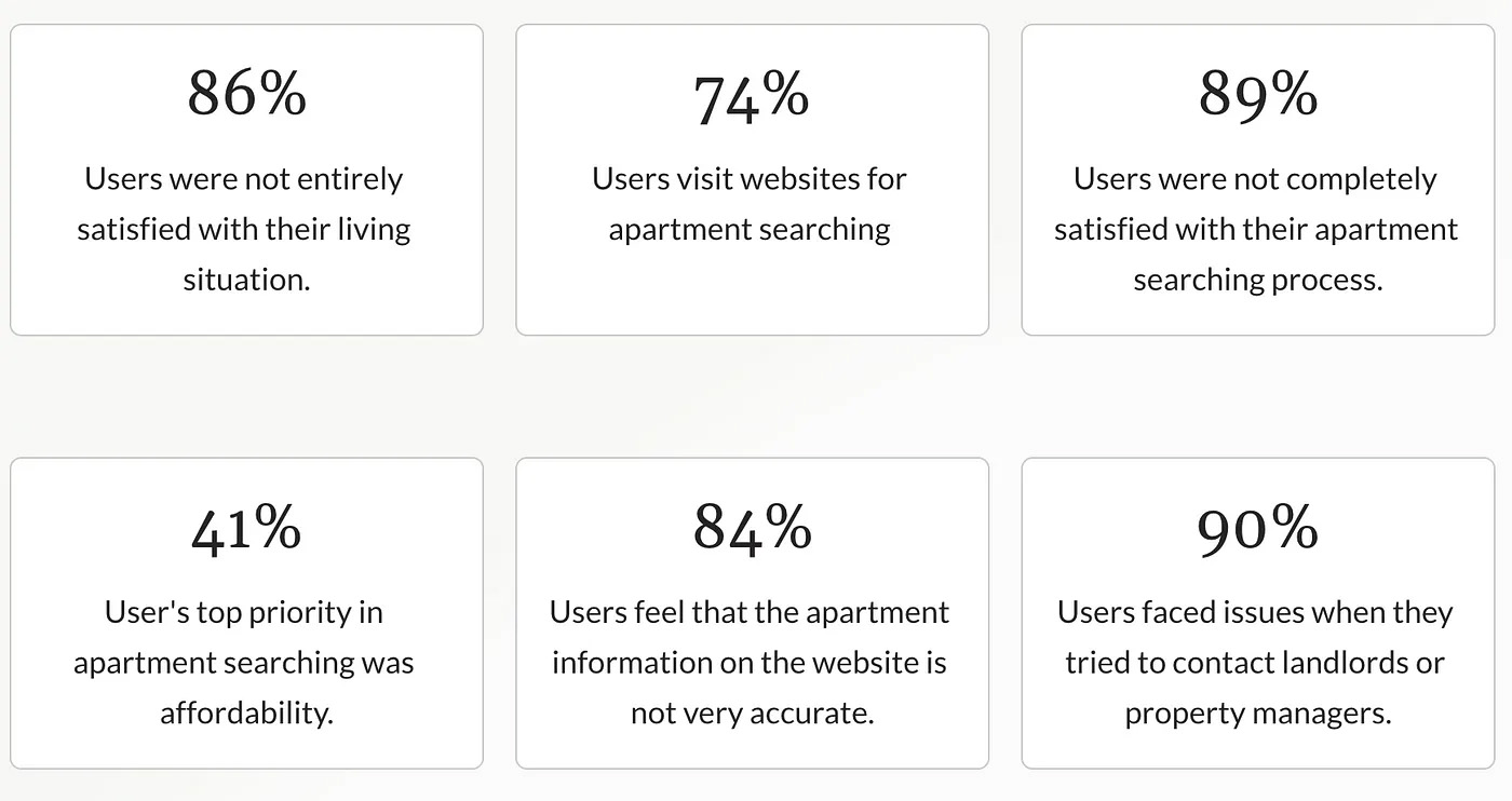
Survey
To help expand our research, we sent out a survey asking students about their apartment hunting process and living situation. This helped confirm our findings, but was a little surprising as I wasn’t expecting that many people to have the same issues.
Results can be found below:
Analysis
Following our individual user research, our group came together to synthesize the data and discover the key findings.
We organized our findings into an affinity diagram in order to better ascertain the key ideas. We found that the biggest issues lied in website information, communication, and the journey of finding an apartment.
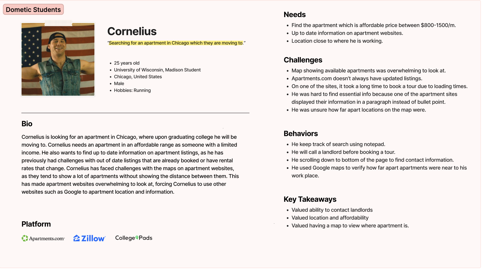
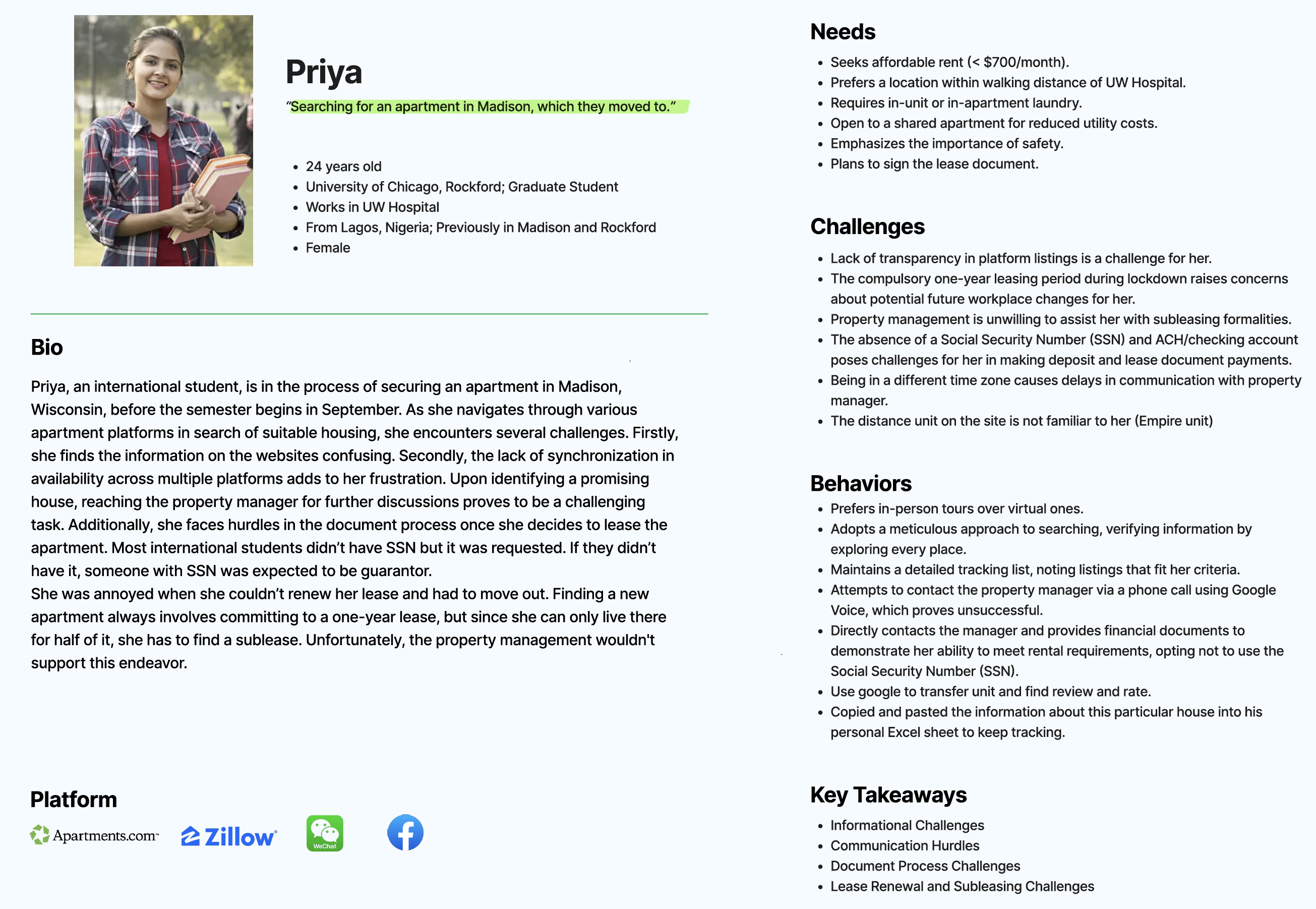
Personas
We created personas, a representation of our use population. We decided to make 2, one for domestic students, and one for international students, since we had happened to interview a lot of international students.
The key ideas we got from each persona were their values.
The domestic student valued location, affordability, being able to contact landlords, and being able to view the apartment on a map.
The International student found hurdles communicating with landlords and navigating documents.
Journey Mapping
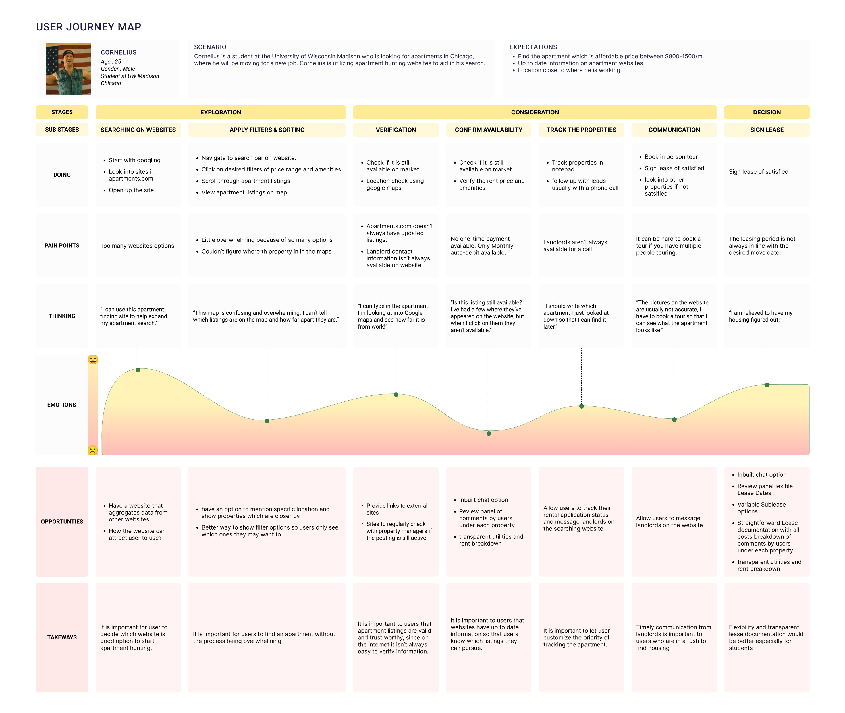
Our group created a user journey map based off of the domestic student persona. We choose this persona over the international student because we felt it was more representative of the general student population.
For me, the opportunities section was the most exciting, as it gives us a lot of ideas for our prototype and draws a lot from the pain points users faced.
Deliverables
For more details on the project, see the deliverables below:
UX Research PlanA presentation outlining the research we conducted. This shows the research methods we used and the desired outcomes.
Design BriefA presentation outlining. This presentation includes a few items I decided not to include in this case study for brevity. We created an experimental outline for an AB and created project goals using the Heart Framework. These artifacts will serve as well when we start prototyping ideas for an application to help alleviate many of the issues we saw in our user research.
Takeaways
We found that many students found the apartment searching process overwhelming and confusing. There are a lot of listings, amenities, and factors to navigate, not to mention the fact that some websites had inaccurate information.
Our next steps are the prototyping stage, where we plan to come up with a way to search for apartments in a more efficient and accurate manner.
App Prototype
Continuing off of research from last semester on apartment hunting, I went on to develop a prototype for an app that could help solve some of the issues I encountered in my research.
How Might We Statement
I first created a how might we statement to help frame my problem and purpose of my project:
How might we enable users to efficiently and accurately search for, locate, and organize information on apartments so that they can better find affordable housing options?
Sketching
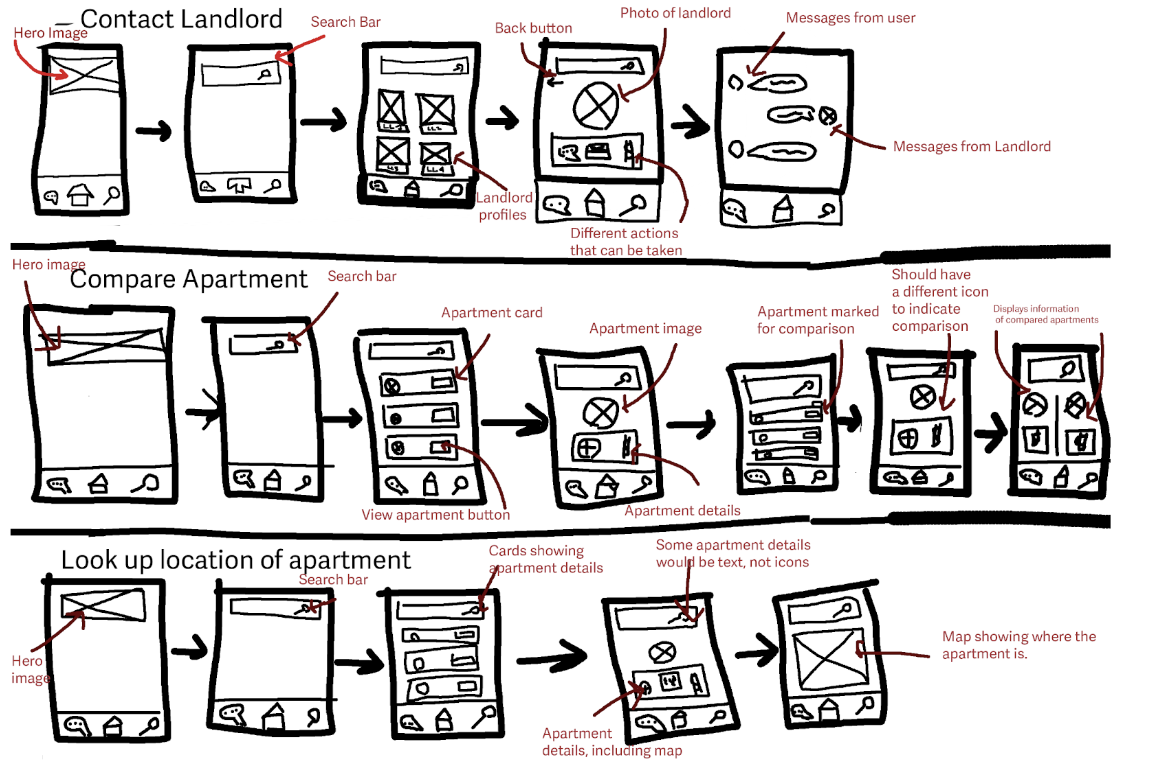
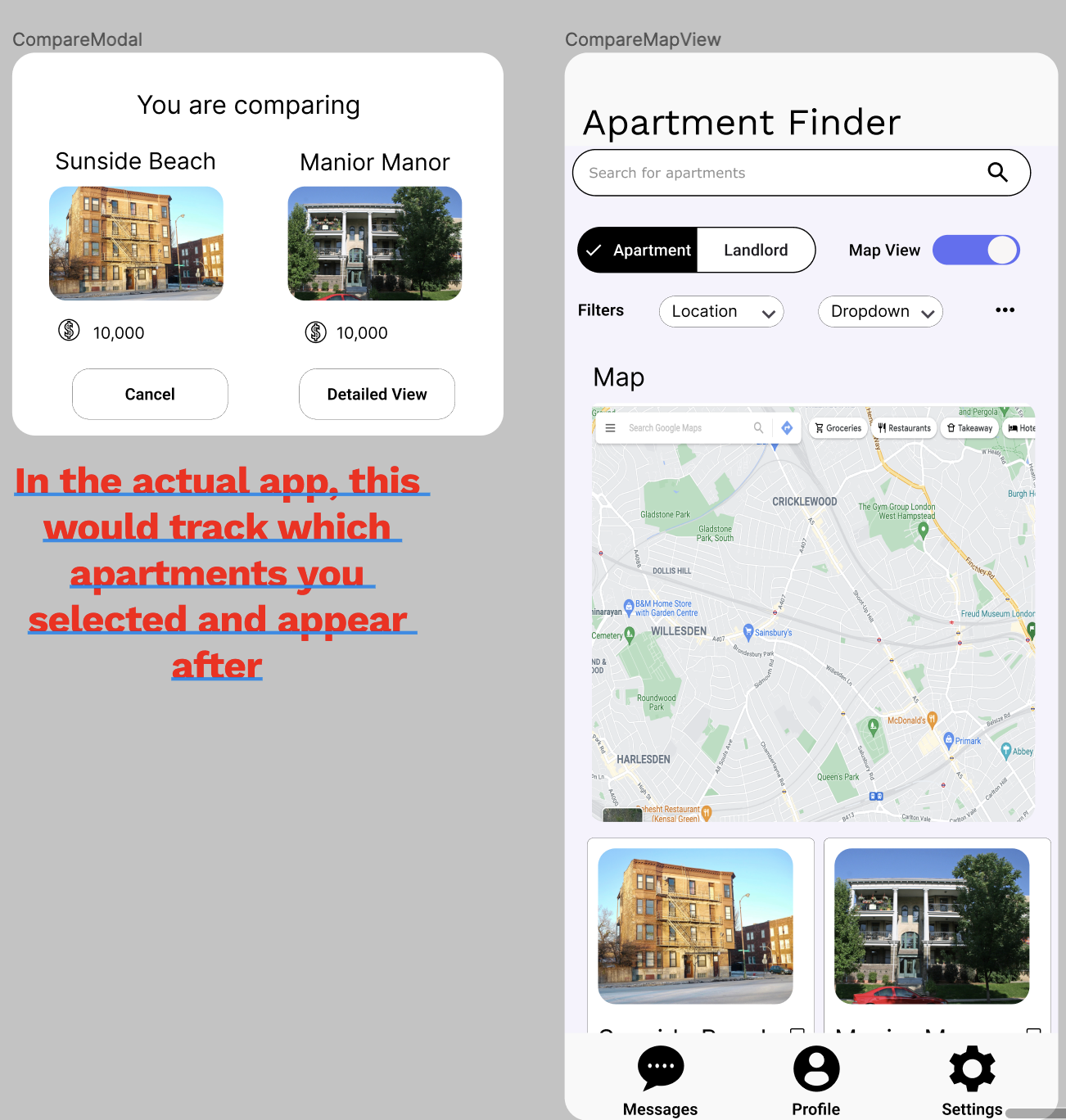
I sketched screen designs for task flows that the app would use. I focused on contacting a landlord, since that was present in my storyboard. I also focused on compare an apartment and look up the location of an apartment since those helped alleviate pain points found in my user research.
Paper Prototype
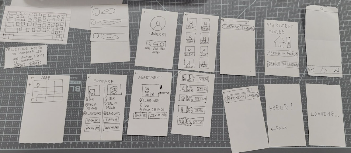
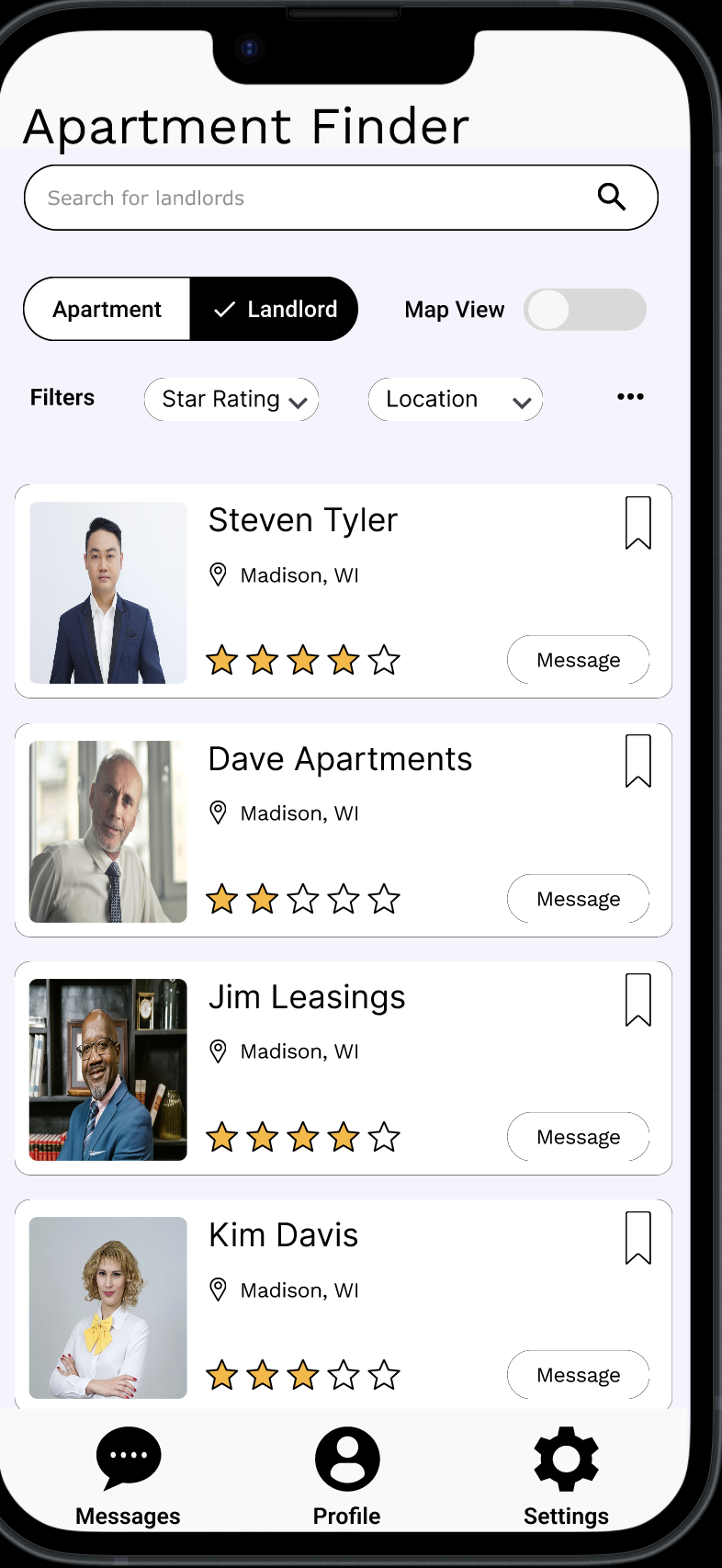
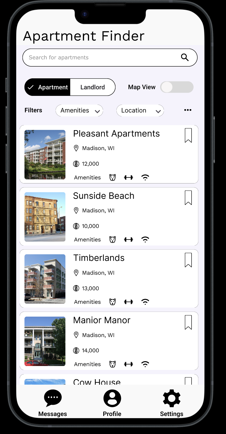
I next created a paper prototype and tested it some users to see how the user flow functioned. I based my prototype on the screen designs I had previously made, but added some extra details. A key change I made from my screen designs was the ability to toggle between searching for a landlord versus searching for an apartment. I made this decision I noticed in the screen design that the search for a landlord and an apartment were nearly identical to each other and wanted to make sure users knew which one there were searching for.
Some important feedback that I got:
- The compare button was not easy to see
- It was not clear what to do on the search page, since there weren't any suggested filters
- It wasn't clear what the compare button did.
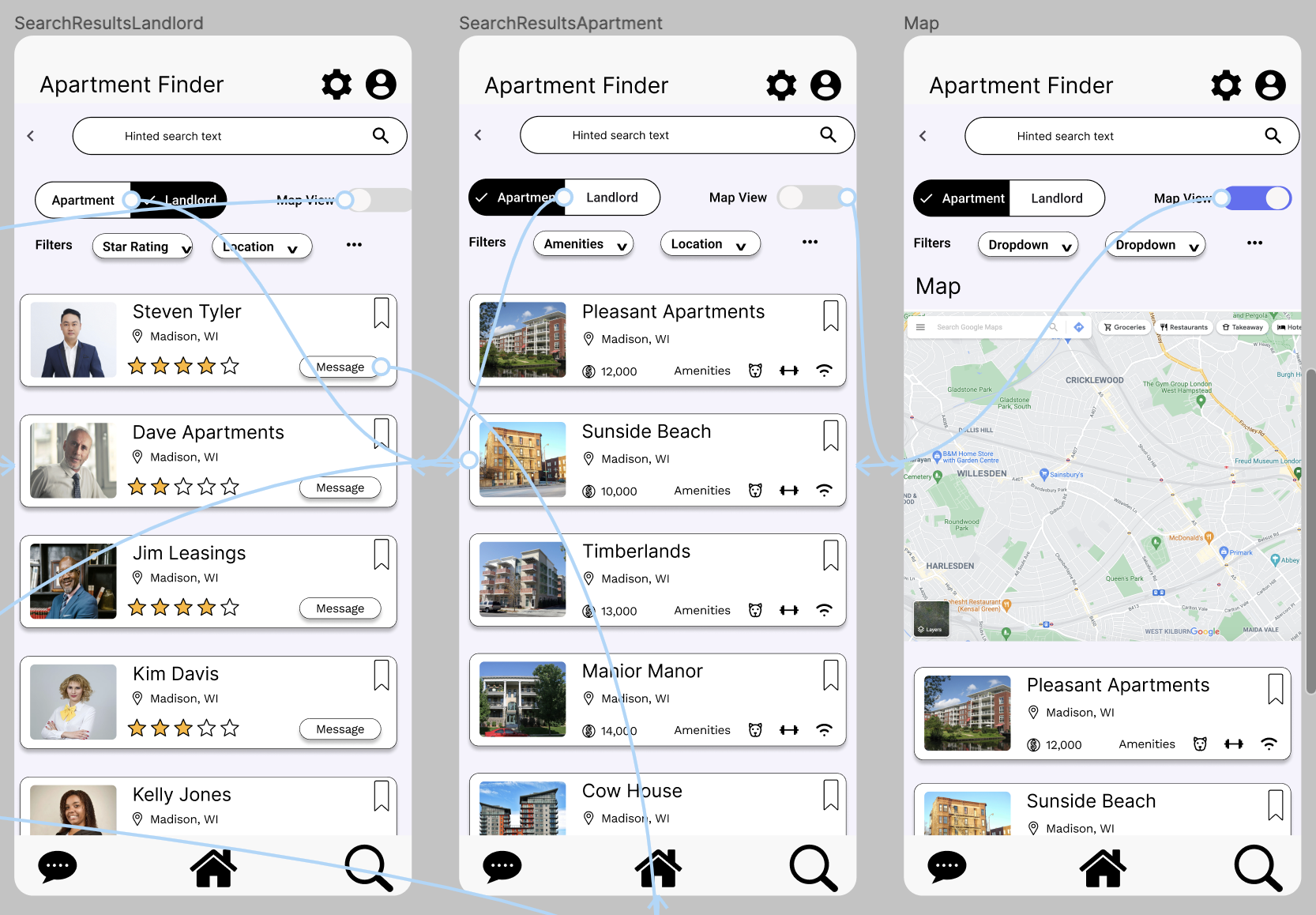
Wireframes
I created wireframes of my app. I used an external component library to help create my wireframe. This did make the process faster, but I had to change a lot of the components later on.
One notable change I made from my paper prototype was the inclusion of some example filters, since one of my test users was confused by the search page. I also made the compare button more prominent, since it was not noticed initially in my paper prototype.
Interactive Mock Up
I further iterated on my static mock up by implementing interaction. One thing I discovered during the process of creating interactions is that I can utilize some of these interactions, such as scrolling or modals to alleviate my spacing issues.
Final Mock Ups
Based on peer feedback, I made a few changes with my final design.
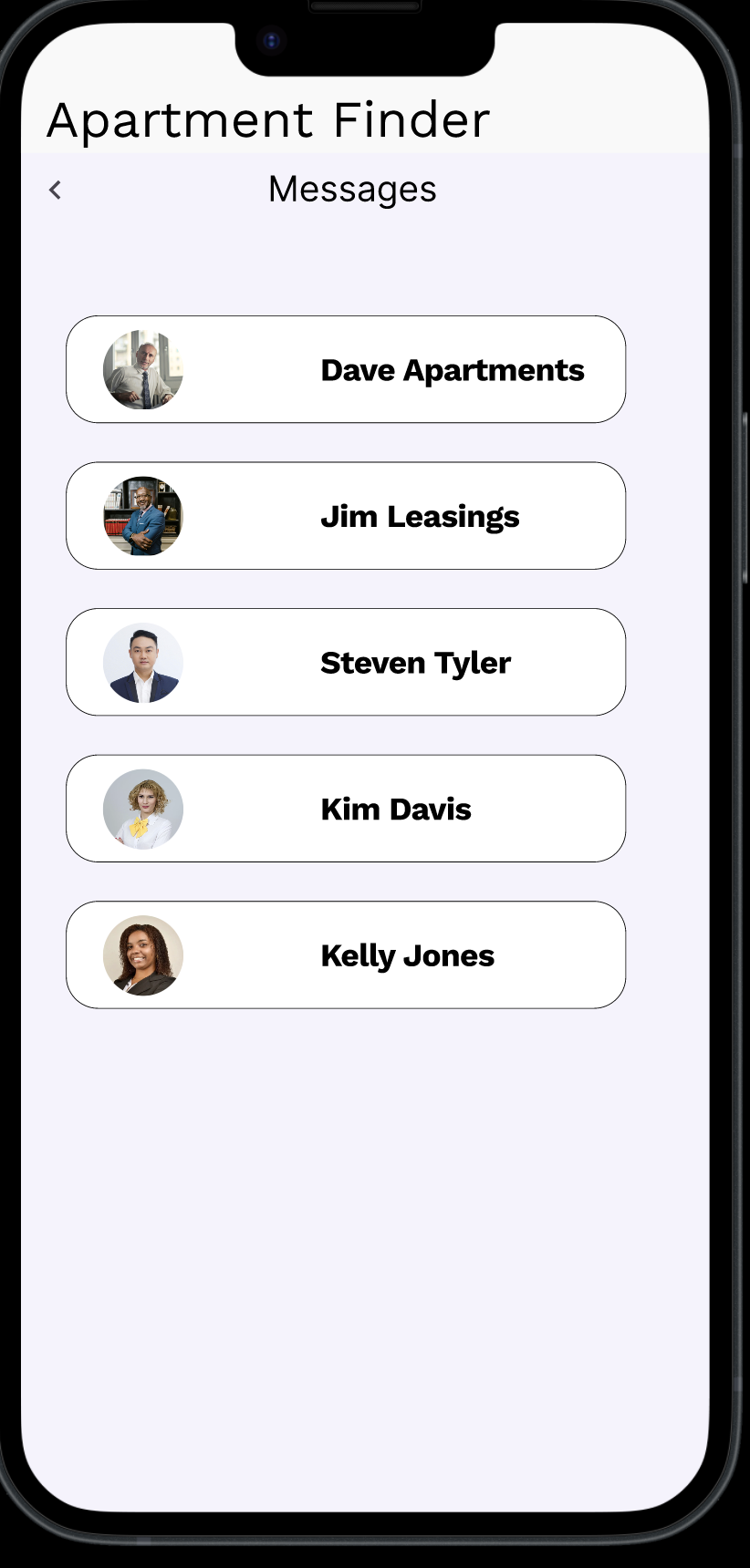
- Changed the navigation to have search as the primary focus. The navigation bar items were changed to messages, profile, and settings, each of which lead to a separate screen without a navigation bar where the back button is how the user gets back to their search.
- Made several improvements to spacing and alignment. Much of the initial design was crowded visually and have inconsistent spacing and alignment.
- Added scrolling functionality for many of my screens. I found that I had not previously considered scrolling in my prototype. I implemented scrolling to better utilize the space of my app and make it so that the information on each page wasn't crammed into that page.
Takeaways
- Starting simple in the design process can help keep the focus on the user flow. My app had a lot of extraneous details, and I have I had started with the high fidelity mock ups, I might have gotten bogged up in details like what the apartments names should be.
- Shortcuts in design, such as wireframes, can help create a great starting point, but you aren't married to those designs and are welcome to change them.
- Iteration and feedback are very important in design. A lot of key changes, particularly those in user flow and visual design, were suggested to me by test users or peers. Sometimes it takes a fresh set of eyes to see the errors in your design.